#3dHawkFeathers – Behind the scenes

It all started with a sketch (seen at left, edge puck texture was added later) as I waited for some photos to export. I haven’t done a whole lot of coloring and drawing since high school art class (aside from countless doodles that have taken over my notebooks over the years), but every once in a while a light bulb goes off in my head, and my need to undertake a creative art project revs up. After I made this sketch of a portion of the Chicago Blackhawks logo, the plan to do a version in colored pencil became immediately clear, and the process of making my vision a reality became immediately daunting. I wanted it to be perfect, but could I make it happen?
The first step was to re-familiarize myself with the colored pencil medium. It’s one of my favorites, but with so much time in between projects, I always have to spend some time re-learning how they blend, what colors work together, and a slew of other properties specific to Prismacolor colored pencils. Over the course of a few days, I played with textures, shadows, and color mixes to ensure I had the perfect pallet to achieve the photorealistic look I was going for.

In the project’s first incarnation, I had thought of doing the edge in stainless steel. Quickly realizing my ability to accurately portray this texture in colored pencil wouldn’t be up to my standards, I racked my brain trying to think of another material to duplicate. Well, it took longer than it should have and the side of a hockey puck finally popped into my head – A perfect fit that took me longer to think of than I like to admit. This was probably the hardest texture to nail down, but a handful of practice attempts later, I had the technique down and I was ready to get started on the final piece.

While coloring the piece was important to the final the 3D illusion, nailing the correct perspective of the feathers was crucial. I knew I wanted to photograph the final piece, so the 3D effect would only work when viewed from a specific angle. All of the vertical lines in the piece actually converge on one point about 1.5 feet below the tip of the green feather. But thanks to the optics of cameras, all of those lines would become parallel verticals when photographed at the the the correct angle – selling the 3d effect. To find the correct vanishing point, I simply set up my camera and pointed it at the outline at the angle that I liked the most. I then drew lines to an arbitrary vanishing point, and checked the viewfinder to see if the lines were parallel. It took a few tries, but once I had my parallel lines I was able to flesh out the full outline. The other quality I could achieve when photographing the piece at an angle was a blurred background. Since the piece wasn’t shot head on, the elements farther away from the lens would be slightly blurred and out of focus. This effect was too complicated for me to draw, but goes a long way in giving it the look of an actual object sitting on the surface.

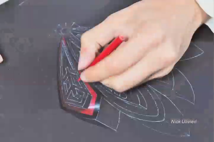
Before I got to work on the final piece, I constructed the final outline on tracing paper because I didn’t want to mar the final matboard with pencil lines and eraser marks as I experimented with the perspective. Once the final outline was built, I flipped over the tracing paper sheet and followed the outline with a heavy line of light-grey colored pencil. It was then time to transfer outline to the black mat board so I could begin the final piece. I taped down the tracing paper to the black mat board, and began to trace the lines so that I would be left with a light outline on the board. I’m glad it worked the first time because the tracing paper seemed to be weakening and stretching a bit from the amount of times I had traced, erased, and outlined on it.

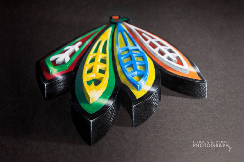
Once the outline was transferred, it was time to color. It took nearly 10 straight hours of coloring to complete, but I finally got it done, and I was extremely happy with the final results. I set-up my camera close-by so I could time-lapse the progress. Though the piece came out better than I had imagined, the time-lapse left me a bit disappointed, but it is still fun to watch. I zoomed in on a relatively small area in hopes of capturing the details more clearly. Though I tried to keep the board in this small area, I wasn’t always successful, and I spun/moved to board around a lot more than I imagined I would in order to achieve smooth lines and curves based upon the area I was coloring in.
This is what the near final piece looks like when viewed straight on. In this version you can see the slight vertical stretching I imparted to the overall outline, as well as the non-parallel vertical lines that appear to be parallel when photographed at the proper angle.


Once I was done coloring, I set up to photograph. On the final shot, I aimed a small spotlight in the lower right-hand corner of the piece, opposite the direction the shadows were falling on the feathers, to give a greater sense of directional light. Once I had the photographs I brought them into Adobe Lightroom and cleaned them up a bit. I cloned out countless flecks of colored pencil that had embedded themselves into the black mat board, and slightly adjusted the perspective to make sure all verticals were in fact, vertical. The final step was adding the drop shadows along the surface the feathers were resting on. A few color and contrast adjustment later, I was finished! In total, I spent nearly 40 hours practicing, outlining, coloring, and photographing in order to create the final piece. I hope you’ve enjoyed my walk-through the process!